The University of Massachusetts Amherst Student Union with Shepley Bulfinch
Photo credit: Derek Noble, AIA on behalf of Shepley Bulfinch
Built in 1957, the Student Union at UMass Amherst was the first building on campus dedicated to student organizations and extracurricular activities. Designed in the modernist style, its curved brick vestibule entrance has served as an architectural backdrop for events, student expression and campus tours over the years. The interiors concept for the Student Union built off this important history, recognizing the building was a primary place for students to gather, organize, relax, and learn, and that their story was the story of the building.
Rendering courtesy of Shepley Bulfinch
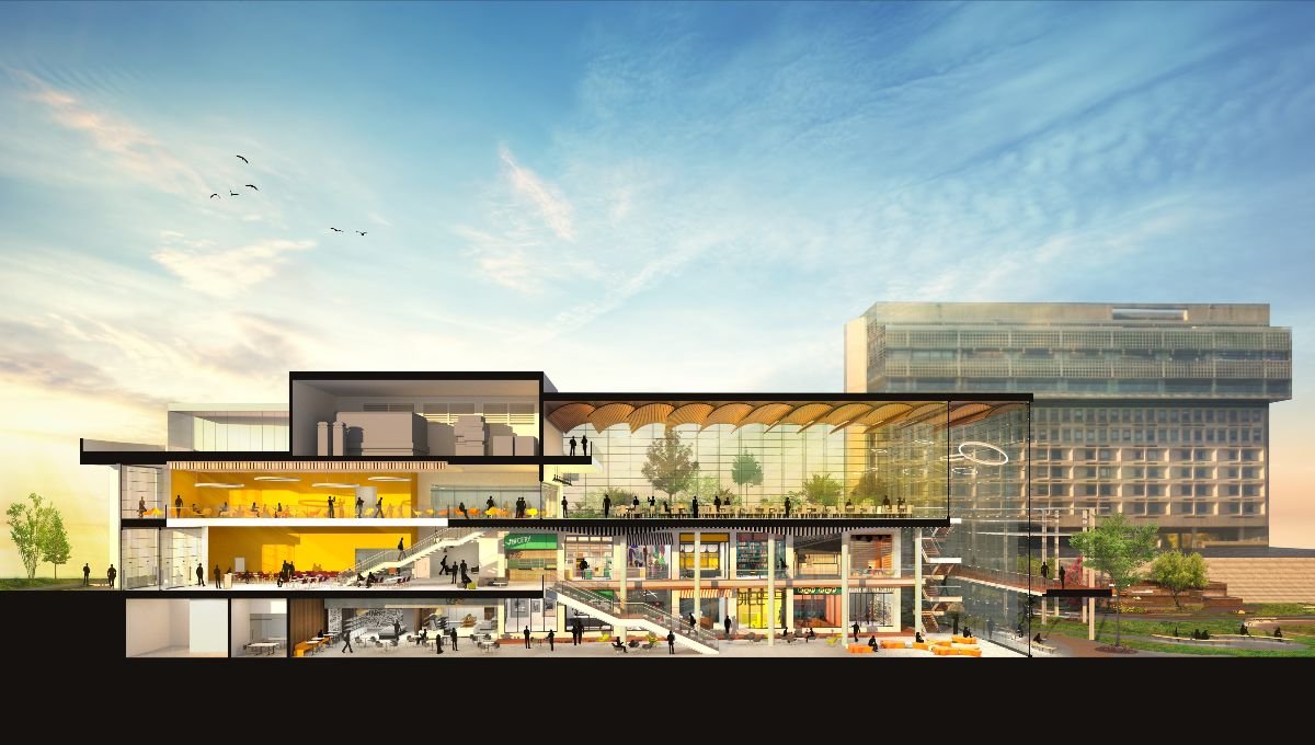
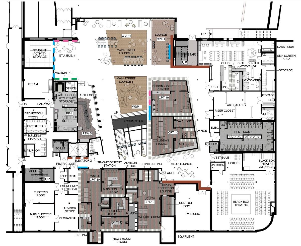
Shepley Bulfinch won a competition that reimagined what was possible within the Student Union by putting forth a bold proposition: by lifting the 8,000 SF Ballroom one-story, the once dense and circuitous interiors would be open, connected and layered visually to the spaces within and the campus landscape without. With that move conceived, the building’s interior architecture opened up to support the program within by providing spaces for serendipitous connections and collaboration.
The process of getting to know the UMass Amherst student body and student life staff was one of the most rewarding parts of this project. As we developed the program, established adjacencies, and started shaping the interior architecture, we worked side by side to understand how students wanted to thrive in this building as well as how to create materiality that served as a strong backdrop for student life to flourish.
Graphic courtesy of Shepley Bulfinch
Photo Credit: Derek Noble, AIA on behalf of Shepley Bulfinch
The Interior Design concept focused on the three aspects. First was the inherent industrious nature of the UMass Amherst Student Union that helped to create countless student run businesses along with over 200 registered student organizations. The new steel elements that were introduced to support the Ballroom and other plan interventions were expressed in a dark grey paint and balance with the raw materiality of wood in glulam at the Forum Stairs, the end grain wood flooring on the Ground Floor and the Ballroom wood vessel within the glass box of that vertical expansion.
The second was the eclectic nature of the student population that live in this building. It was important to create slight variations in visual identity for each of the student owned spaces with specialty lighting as well as provide plenty of space for signage and graphics to be layered in over time once students moved back in. The visual identity of the two food service venues is distinct to those cultures. Various sizes of open and closed lounge and meeting spaces throughout provides a social fabric in which students can connect anchored by carpets and furniture that celebrated the maroon of Massachusetts’ flagship institution.
Graphics courtesy of University of Massachusetts, Collage courtesy of Shepley Bulfinch
The third was that the space had to feel vibrant and reflect the activity that was going to take place in the building. This was accomplished through grounding the building in an interiors palette that spoke to the architectural experience of the exterior of the building that would allow the dark accents, UMass branding, and wood interventions to stand out. Interior glazing allowed views and orientation to daylight to breathe life into a once dense and dark interior. The new vibrancy will grow as students take back over the building, adding signage, graphics, and personal identifying objects to their given spaces.
We never let go of those concepts. We never let value engineering, coordination, or any of the other idiosyncrasies of such a bold architectural move stop our drive to create a space that was for and about UMass Amherst students. I’m grateful to have been part of such a transformative project and look forward to seeing the space come alive with student life this coming Fall.
Photo Credit: Patricia DeLauri, AIA on behalf of Shepley Bulfinch
Courtesy of Shepley Bulfinch
Rendering courtesy of Shepley Bulfinch
A special thank you to our collaborators:
UMASS Amherst
Vanderweil Engineers
Anser Advisory
Nitsch Engineering
Acentech
Mohar Design


