Autodesk Boston Workspace Expansion with Utile
Photo Credit: Chuck Choi
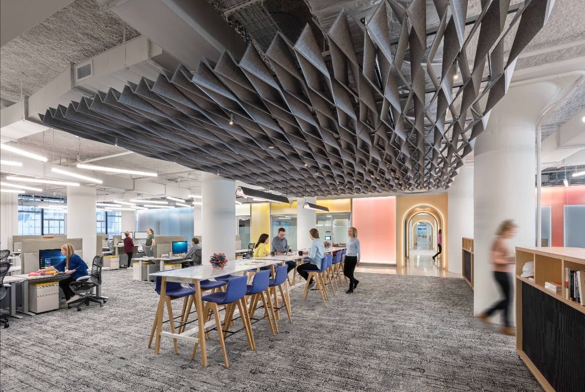
In 2019, Utile partnered with Autodesk and STV|DPM to design Autodesk Boston’s new workspace expansion in the Innovation & Design Building in South Boston. Autodesk’s design and construction software teams in Boston are rapidly expanding, and the company needed to maximize the number of workstations in this expansion to their flagship meeting and event center (MEC), which our team designed in 2017. To achieve efficiency without monotony, the parti of the project was a legible archipelago of architectural elements among the “sea” of open plan desks.
Photo Credit: Chuck Choi
Each of the “islands” in the archipelago is designed to allow natural light to penetrate through the entire space. We arranged “solid” program, such as meeting rooms and support spaces, in narrow bars along the cross axis, creating nearly uninterrupted visual connection between the parallel window walls that run along the north and south facades of the storehouse. The central island is a luminous bar of enclosed rooms that floats between the muscular storehouse column grid. The 34-color gradient that wraps the bar helps organize and orient teams within the ring of workstations that surround it. Inspired by Autodesk’s focus on innovation in the building industry, the painted wall is diffused by an aluminum honeycomb core polycarbonate skin that changes the viewer’s perception of the intensity of the color gradient as one moves throughout the space.
Photo Credit: Chuck Choi
Photo Credit: Chuck Choi
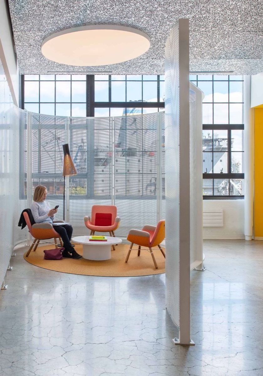
Secondary islands are interspersed within the major ring of workstations. Light permeable collaboration pods, nicknamed “kiva lites,” are playful riffs off of the formal Kiva (a circular meeting room) in the adjacent MEC. Again exploring ideas of visual perception, we designed the slats of the kiva lites with laminated wood and PET felt to create a moire effect. Custom designed mobile carts with hidden storage and acoustic panels serve as minor space dividers that can be deployed as bars for employee events, while a hovering folded PET felt baffle and long breakout table define a large area of relief within the largest block of desks.
The east side of the expansion is bounded by a bespoke porous metal screen that allows light through while still providing a sense of privacy between the workers and the elevator lobby. The screen loops around at one end to form a waiting area for guests.
Photo Credit: Chuck Choi
The new workspace is connected to the MEC with a continuous circulation axis that was conceived of during the design of the MEC and rigorously maintained through the design of this project. The axis creates an uninterrupted visual connection through the entire 275’ storehouse bay. We highlighted this important view with an arcade of illuminated arches. At the end of the axis, the arches transform into a forced perspective trompe l’oeil that extends the perceived depth of the view, and also hosts seating niches for focused work.
As a swiftly transforming technology company, this worker-focused expansion project is key to Autodesk’s innovation mission, and the design helps manifest this mission in the architecture itself.
Photo Credit: Chuck Choi
A special thank you to our collaborators:
Lee Kennedy Co, Inc., General Contractor
Mark Richey Woodworking, Millwork
Vanderweil Engineers, MEP/FP Engineering
Code Red, Code Consultant
Acentech, Acoustics
Lam Partners, Lighting
COP, Furniture


