
FIXT with Studio Troika


Hear from the designer in the episode below for more in-depth project stories!
-
Hear from the designer in the episode below for more in-depth project stories! -

Photo Credit: Sabrina Cole Quinn Photography
Imagine you are arriving at Smith and Wollensky, in Wellesley. You request the window view along Washington Street. It’s close to dusk, you make your way through the menu and place your order. The first course arrives and suddenly you glance out the window and notice the glow from an illuminated wall inside the building across the street. You might wonder how you missed it coming in, but you make it a point to approach the building after dinner. Your check arrives and you head across the street. As you approach the building, each window gives you a little glimpse into what they have to offer. One window offers a digital screen visualizing a story of their craftsmanship, the next, a backlit display of dental products, and finally, a view of the company logo. All of these details are what make up this state-of-the-art Cosmetic Dentistry office, FIXT.


Rendering Credit: studioTROIKA
Before we jump further into this, let’s rewind to our very first meeting with our clients. Our clients were Dr. Jason Tubo and Lead Dental Assistant Jenny Tubo. From Dental & Healthcare IT, our main connection to the clients was Paul Vigario and Vinny Spinella from surftCT. The Architectural Design team was made up of Michael Samra, Linda Ly, and myself (Eleftheria Konstantinidis) from studioTROIKA. In our first meeting, the Tubos walked us through their thought process and the story behind their vision. Their wish list consisted of “speakeasy” doors, a “quiet space where the hustle begins,” and a space that can successfully demonstrate “high dental technology." They wanted to catch the eye of potential clients as they walked by, or even if they were eating at Smith and Wollensky from across the street. These were just a few of the many visions described by Jason and Jenny which we held onto that continued to inspire us through the process of how FIXT came to be.

As we dove deeper into the process, we got a better understanding of their interior program, and studied the exterior site conditions. We started by dividing the space into Private, Production, and Brand. Once the main elements had their locations, we then layered in curved elements to emphasize the brand, while also creating a hidden layer of spaces, taking inspiration from the client’s love for the style of a speakeasy. As we continued to carry the curves through the space, two crucial elements emerged – the major wall and the minor wall.
We designed the major wall to be the most engaging, pulling people in from the outside in and creating a ribbon effect throughout the main spaces that reverberated through the ceiling and floor details. The major wall serves as the customer's main journey from a hidden lounge and to the treatment rooms so we felt it was only right to bring in the warmth of wood and complete the wall with an illuminated FIXT logo.
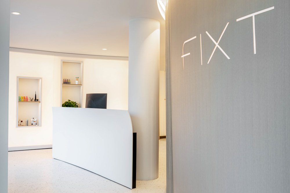


Photo Credit: Sabrina Cole Quinn Photography
In contrast, we designed the minor wall to be just as engaging but on its own journey for both the clients but most importantly, the employees. Starting from the main entrance, it introduces pockets of openings for retail products and terminating to the employees back of house. We were inspired by the clients' passion for creating some of the most realistic veneers in the industry giving the wall itself a veneer effect through a soft backlit Krion surface.


Photo Credit: Sabrina Cole Quinn Photography
As for the rest of the space, we introduced simple materials, but played with patterns and textures. We kept the material palette fairly muted so it wouldn't compete with the major and minor walls. Terrazzo floors lined the open spaces. Wood floors complimented the lounge and treatment rooms to continue the sense of comfort. These subtle architectural moments then allowed us to introduce subtle pops of color in the furniture, artwork, and greenery.

For the high-tech areas, we created a showcase treatment room with movable walls that every first-time client would experience. In this room, we introduced a “switchable” PDLC glass film that would allow content to be projected against the storefront outside and coherently maintaining the client’s privacy. Three moveable walls; one wall revealing the hidden nook, another wall becoming the room separated from the treatment and photo area, and the last wall being the photo backdrop (giving one the option for a white or black backdrop) allowing the space to be customizable.


This process highlighted the importance of collaboration to fulfill our clients' wishes to their highest potential. When the project was completed, we decided to go to Smith and Wollensky, request a window view, and enjoy a delicious dinner as we admired and reflected on our time with FIXT. Then of course…it was time to floss!


Client: FIXT
Architectural Design Firm: studioTROIKA
Dental & Healthcare IT: surfCT
Construction Managers: Wellen Construction
Engineers: Syska Hennessy Group
Lighting: Illuminate
Furniture Dealer: Creative Office Resources
Furniture: Boston Modern Furniture
Dental Products: Patterson Dental
Krion Walls: https: Porcelanosa
Veneer Walls: Surface Materials
Hardwood Flooring: Saulnier Floors, Inc.
Terrazzo Flooring: Terrazzo & Marble Supply Companies
Photography: Sabrina Cole Quinn Photography

Click to listen to Designer Monologues - The Podcast on Spotify!